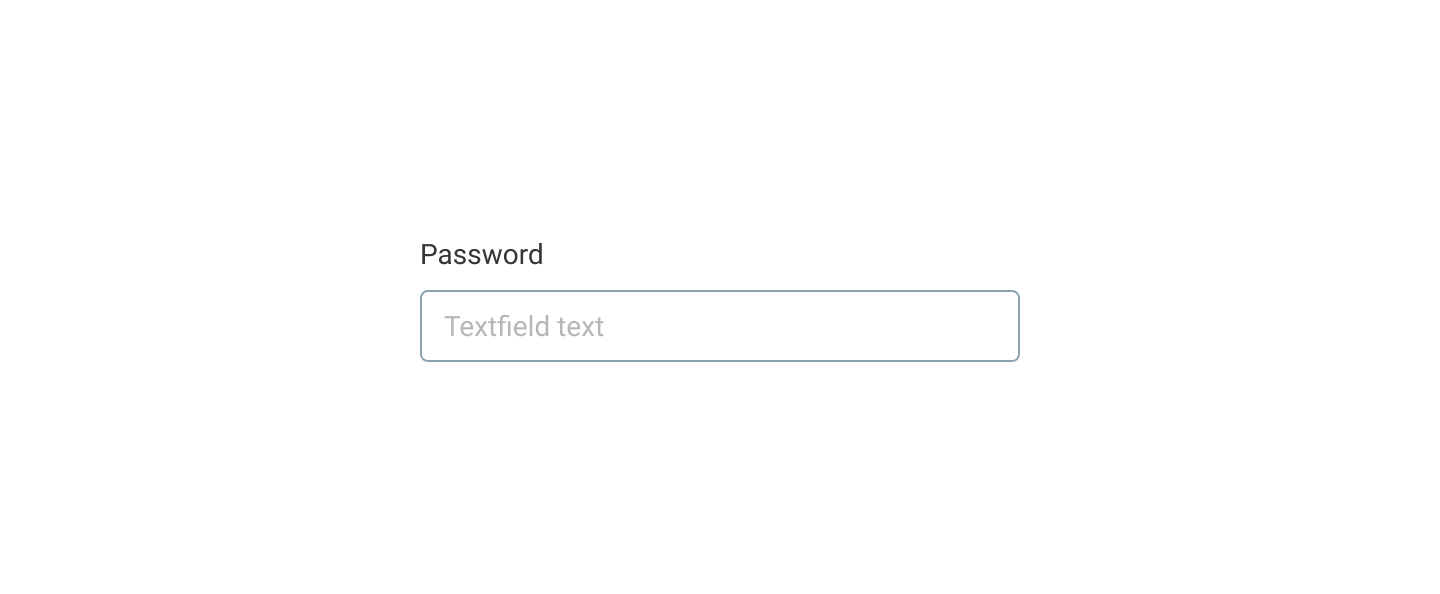
Text input
A text input allows users to enter and edit a one-line value. Values comprise text and numbers and are plain-formatted.
Input description
When to use it#
Use the text input component to allow users to enter or edit a one-line value, such as a username or a password.
Do
When not to use it#
Don’t use text input forms for values longer than one line. Use a text area.
Don’t use text input forms for numerical values. Use a number input.
Don't
How to use it#
Visual representation#
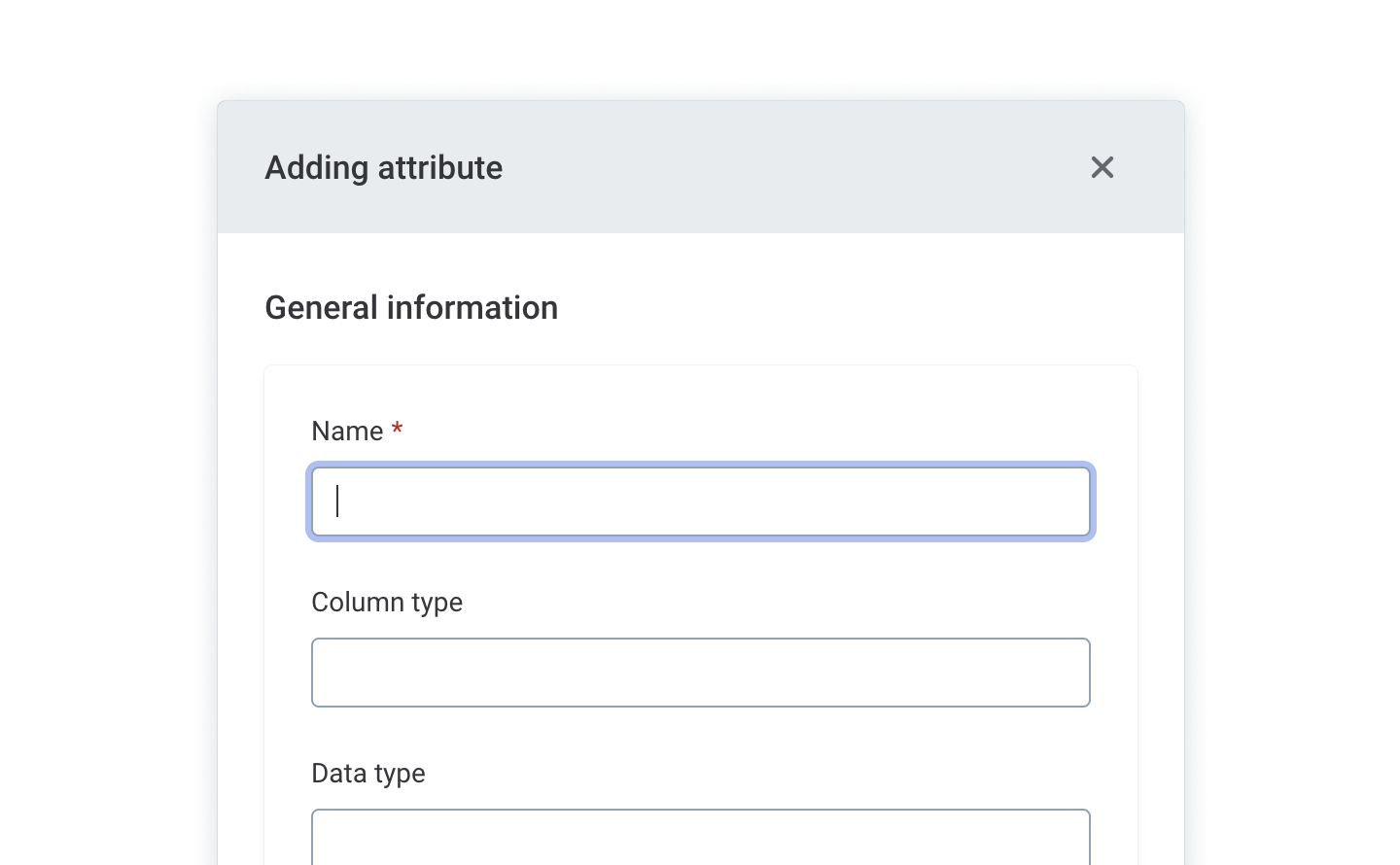
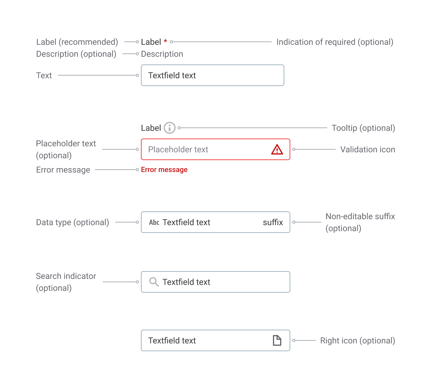
All text input forms are made up of an input area and its label. The label is placed above the form.
Depending on the specific flow and need, there are several design choices for a text input:
Required or optional:
- Required – users are required to enter a value to proceed. The text input can’t be empty.
- Optional – the attribute is optional. The value of this attribute can be empty.
Helper text or not:
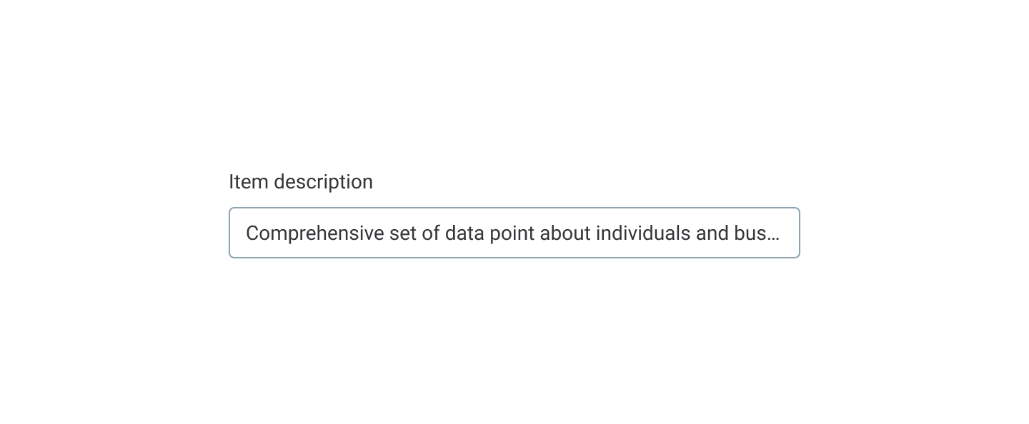
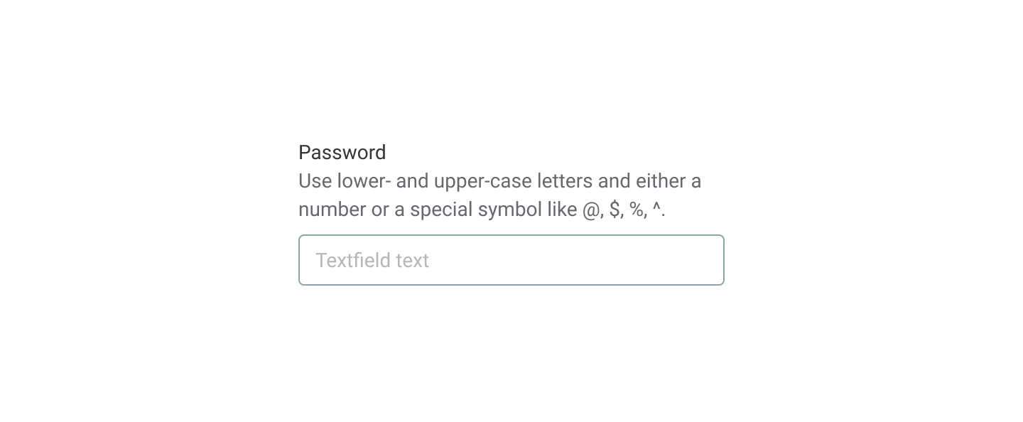
- Description – content that is guiding and so important that all users need see it when they enter a value. This microcopy appears below the label.
- Tooltip – tooltip content is displayed on hover over an information icon next to the text input label. Prefer making the label helpful enough to allow users to understand what value they should enter.
- Label only – make the label informative enough to avoid supportive copy.
- Always consider how important a specific input form is for completing a flow when making a design decision on which type of input to use. Guide users to complete the needed field
- Make the label descriptive enough, and add helpful tooltips or microcopy as needed.
Do
Don't
Anatomy#
Text inputs consist of the following parts:
- Label
- Indication of required (optional)
- Tooltip (optional)
- Hint text
- Input container
- Validation icon
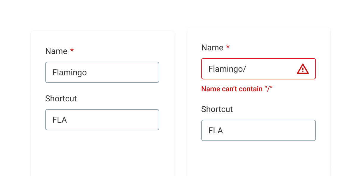
- Error message
For building layouts (spacing in between inputs), use layout components. Please keep in mind that the recommended space between inputs is 16px (1em or M size). Instead of reserving additional space for potential errors, we have made the decision to reposition inputs after errors.
Interaction#
When users click the container of a text input form or navigate to it using the keyboard, the form changes from a default state to an active one. The text input form changes to a filled state after entering a value and clicking outside of the form (or pressing Tab).
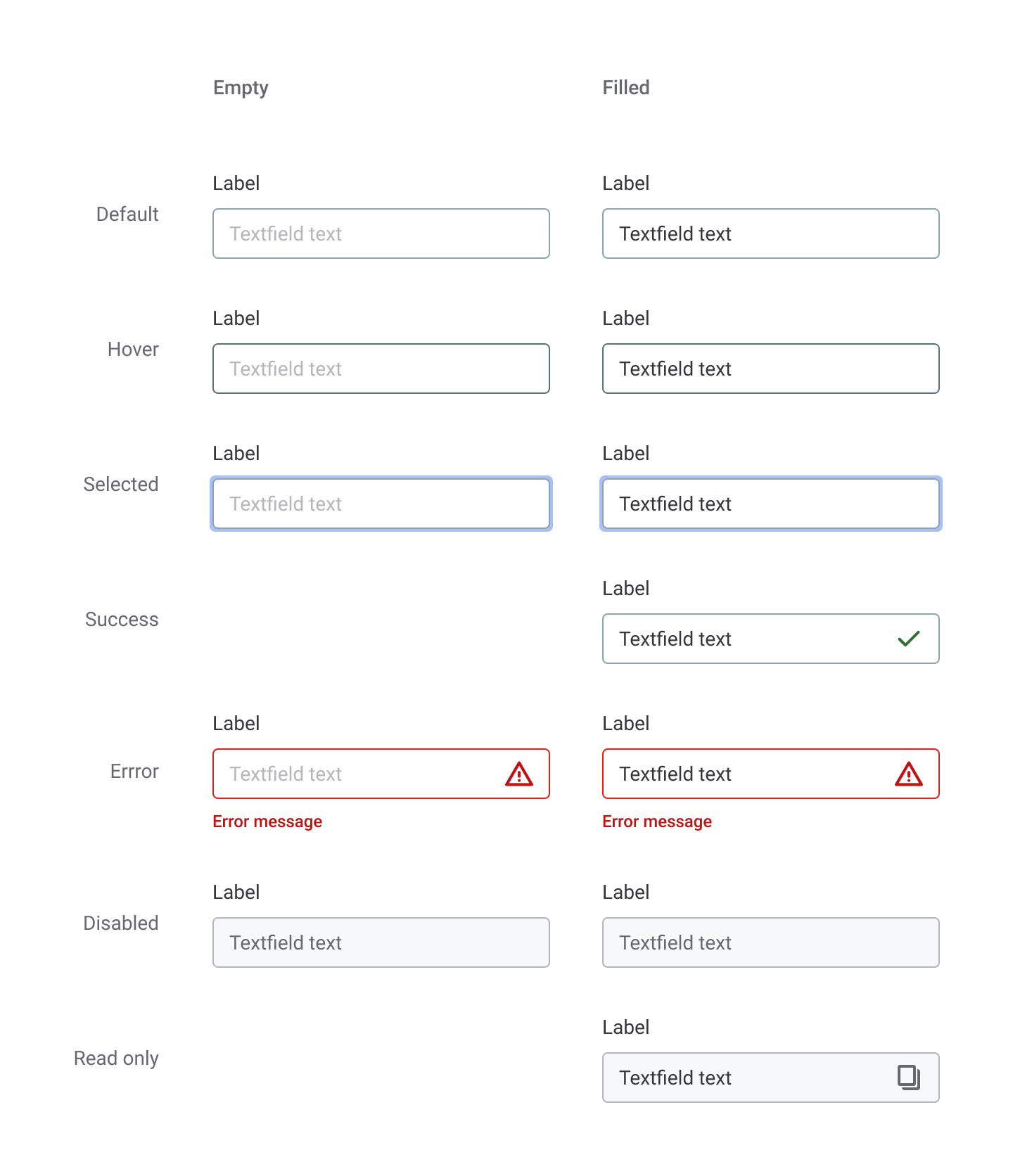
Input forms can also be disabled in two different ways:
- An attribute is not available for editing for a specific category of users. In this case, the input is not interactive.
- An attribute is not available for editing, but users can copy the value using a button. In this case, the input is interactive.
States#
Text input forms have the following states:
- default
- disabled
- active
- filled
Content#
All text input forms have labels. Make the label guiding and descriptive enough so that all intended users understand it. If the label can’t be made guiding enough, consider adding a tooltip for extra information or essential microcopy for content that all users need to see when entering a value. Whenever relevant, provide default text (a hint to help users start typing). Labels are mostly nouns, adjectives, and acronyms. Use placeholder values to guide users. Consider starting the values with an action verb.
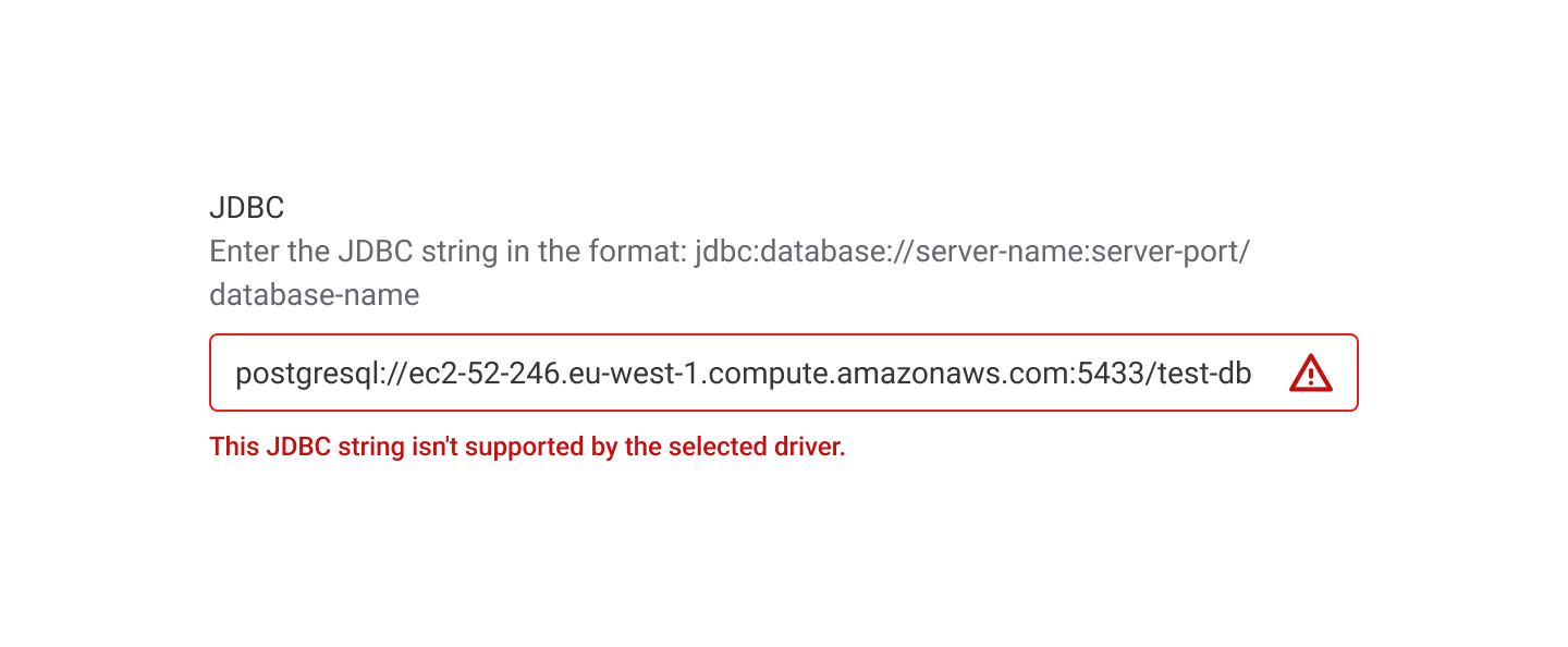
jdbc:postgresql://server-name : server-port / database-name
Enter your username
See the content guide for more info and example of error messages in input fields.